Ocean Motion Teacher Guide Lesson 3
Table of Contents
Click the titles below to jump through the lesson
Ocean Surface Currents Affect Global Weather & Climate
View Of The Ocean From Satellites
Ocean Surface Current Satellite Data
Gathering Data And The Scientific Method
Tropical Pacific Surface Currents
Sea Surface Temperature Anomaly
Weather Going Wild–La Corriente Del Niño
| Lesson Objectives |
Performance Tasks |
|---|---|
To demonstrate an understanding of several satellites and the instruments they carry that collect sea surface data |
Respond to questions regarding sea surface data collected from satellites. |
To demonstrate an understanding that the speed of ocean surface currents vary as distance from the Equator increases |
Manipulate an online surface current visualizer, collect data and determine changes in surface current speeds at different latitudes and longitudes. |
To demonstrate an understanding of where the greatest sea surface temperature anomalies occur on the Equator |
Examine data from the visualizer to determine patterns in sea surface temperature anomalies in the Pacific, Atlantic & Indian Ocean. |
To demonstrate ocean surface patterns or relationships that can explain the weather phenomena, El Niño
|
Identify weather-related patterns in data for ocean surface currents, temperature and winds with special attention given to El Niño. |
Materials:
Student Guide (PDF)
Internet access
Courses Supported: Math, Physics, Earth Science
Grade Level: high
school
Glossary: aerosols, buoy, chlorophyll, electromagnetic radiation, longitude, standard deviation
 Hurricanes wreak havoc in the Gulf of Mexico, tornados tear apart the Midwest,
winter storms move from the Pacific Ocean, cross the Rockies, then
travel up the Atlantic coast. Every day we see weather stories, but
how do meteorologists gather weather data? Satellites, balloons,
ships, buoys, and other instruments collect data that helps us
understand the processes that affect our global weather and climate
and help meteorologists make weather forecasts. Scientists use these
data to calibrate, test and adjust computer models that simulate
Earth’s weather and climate. Scientists model the entire globe as
one connected, interacting system, including oceans, land and
atmosphere.
Hurricanes wreak havoc in the Gulf of Mexico, tornados tear apart the Midwest,
winter storms move from the Pacific Ocean, cross the Rockies, then
travel up the Atlantic coast. Every day we see weather stories, but
how do meteorologists gather weather data? Satellites, balloons,
ships, buoys, and other instruments collect data that helps us
understand the processes that affect our global weather and climate
and help meteorologists make weather forecasts. Scientists use these
data to calibrate, test and adjust computer models that simulate
Earth’s weather and climate. Scientists model the entire globe as
one connected, interacting system, including oceans, land and
atmosphere.
Weather can be defined by five key variables: temperature, wind magnitude, wind direction, water vapor (humidity), and pressure. We write mathematical equations that reveal how these weather variables relate to each other and to external factors such as solar energy. Using these equations to make forecasts is more difficult and requires knowledge of atmospheric conditions everywhere at an instant in time. To make weather predictions, scientists need a global “data snapshot” of the atmosphere that tells us the value of the five key variables at all altitudes and locations. Gathering this amount of data on a planet where 73% of the surface is covered by water is a tremendous challenge. Satellites provide the most efficient means of gathering a global view that fills the voids where data cannot otherwise be collected.
Most of the solar heat absorbed by the ocean is in a belt about 23 ½ degrees above and below the Equator. Ocean temperatures at the Equator are moderated by ocean currents, which continuously circulate and distribute energy to the rest of the globe. This lesson encourages the investigation of ocean surface current patterns and their link to weather phenomena such as El Niño. You are invited to explore data visualizers to find patterns in ocean surface currents that reveal El Niño patterns from the past and potential patterns for the future.
Students
are asked to take an online![]() preconceptions
quiz consisting of 12 questions. When they submit their responses, a
pop-up window appears that shows the correct response to each
question and provides additional, clarifying information. All 12 questions, their correct
responses and additional information are provided below.
preconceptions
quiz consisting of 12 questions. When they submit their responses, a
pop-up window appears that shows the correct response to each
question and provides additional, clarifying information. All 12 questions, their correct
responses and additional information are provided below.
Engagement activities such as this one are typically not graded. Student responses to this survey will help determine how much accurate information they already know about satellite data collection.
| True
or |
Statement |
|---|---|
1 True |
The lowest Earth-observing satellites take about 90 minutes to travel around the Earth. Satellites orbiting around the Earth have the minimum speed (typically 17,000 mph) needed to stay in orbit and not impact the Earth. The satellites orbit without any propulsion. They are constantly pulled down by the Earth's gravity, but because of their high speed along the orbit (at a right angle to gravity), satellites do not hit the Earth. Their inertia keeps them moving and the force of Earth's gravity bends their path around the Earth. |
2 False |
Satellites cannot collect their Earth-observing data at night. Some satellites depend on reflected solar energy to gather data and so can only work during the day. Others measure thermal radiation of objects and substances or generate their own radar or laser radiation. These satellites do not need the Sun's radiation and can collect data at night. |
3 True |
Satellites orbiting the earth thousands of times per year use almost no rocket fuel or propellant. Once in orbit, traveling at high speed, satellites do not need fuel to keep traveling. Newton said: “Objects in motion tend to stay in motion”. The Earth pulls satellites downwards at right angles to the orbit. This does not slow the satellite, which will continue orbiting until friction with the low density atmosphere causes it to slow down and leave orbit. |
4 False |
Clouds block all satellites from collecting Earth surface data. Some wavelengths of electromagnetic radiation measured by satellites (radar, microwave) pass through clouds. Clouds do block visible radiation that is seen by our eyes. For example, pilots in airplanes above the clouds communicate using electromagnetic waves with the correct wavelength that easily pass through the clouds. |
5 False |
NASA data images don't show any clouds because data were collected on a date and time when there was no cloud cover. A large percentage of Earth's surface is covered by clouds every day. The images that NASA provides are typically composites built from many images using data collected over several days or weeks. |
6 False |
All satellites collect data by shooting laser beams down and measuring the reflections that come back. Some satellites measure reflected solar, laser, or radar energy or emitted thermal radiation coming from Earth. It is important to study many different wavelengths of radiation because each wavelength can provide more information about conditions of the surface that emitted or reflected the radiation. |
7 True |
Some satellites use invisible radiation to make Earth measurements. The invisible radiation can be very useful in measuring the Earth's surface environment. Invisible radiation, such as thermal infrared radiation, can tell us about the temperature of a substance or object. A hot and a cool kitchen pot look the same to our eyes but emit very different amounts of infrared radiation. |
8 False |
Most satellites orbit far enough away from Earth that each image made sees a whole hemisphere of Earth. If all satellites were placed that far away, it would be hard to distinguish changes that happen on a small scale. Most Earth-observing satellites orbit close to the Earth, and each image collected covers only a small region of the Earth's surface. |
9 True |
Satellites that need to collect data over the entire Earth usually fly over the Poles and not around the Equator. Once in orbit, satellites do not have the fuel or propulsion necessary to change their orbit. Most satellites collecting data over the entire Earth will orbit over the Poles. As the Earth slowly rotates, the satellite will observe different regions on the surface after each 90-minute orbit. |
10 False |
Satellites that need to provide satellite TV services to a city usually fly over the Poles and not around the Equator. To provide continuous service to a city from a single satellite, the satellite has to stay above the same location on Earth all the time. The only way to accomplish that is to orbit around the Equator with an orbital period of 24 hours (matched to the Earth rotation period). This orbit is called a geosynchronous orbit. |
11 True |
Satellites typically use solar power rather than nuclear power to run their onboard electronics. Solar power is preferred because there are no clouds in space and solar power is a simple, dependable, easily engineered source of energy. |
12 False |
Most satellites use up their rocket fuel after 2 months and have to come back to Earth. Satellites do not require power to stay in orbit. Satellites are given a high speed so that their inertia keeps them orbiting. |
100 |
Overall Score (%) |
Could
global shipping traffic collect enough data from the ocean surface to
determine how currents affect weather and climate?
 There
is a river in the ocean. In the severest droughts it never fails, and
the mightiest floods…it never overflows. Its banks and its bottoms
are of cold water, while its current is of warm. The Gulf of Mexico
is its fountain, and its mouth is in the Arctic Sea. It is the Gulf
Stream. There is in the world no other such majestic flow of waters.
There
is a river in the ocean. In the severest droughts it never fails, and
the mightiest floods…it never overflows. Its banks and its bottoms
are of cold water, while its current is of warm. The Gulf of Mexico
is its fountain, and its mouth is in the Arctic Sea. It is the Gulf
Stream. There is in the world no other such majestic flow of waters.
Matthew
Fontaine Maury’s 1855 The
Physical Geography of the Sea.
Ship crews have been taking intermittent measurements of the ocean surface conditions for hundreds of years. The American naval captain, Matthew Fontaine Maury, pictured on the left, and the 1853 Brussels Maritime Conference are credited with promoting the use of a uniform system for ship-based collection of meteorological and sea surface measurements. Captain Maury’s nickname was "The Pathfinder of the Seas" due to his extensive work mapping ocean and wind currents. He served in the U. S. Navy. After Virginia seceded during the Civil War, he served the Confederate States of America by helping to obtain ships and other vital equipment. Maury published the Wind and Current Chart of the North Atlantic, which showed sailors how to use the ocean's currents and winds to their advantage and drastically reduce the length of ocean voyages. His Sailing Directions and Physical Geography of the Seas and Its Meteorology are still in print. Maury's uniform system of recording oceanographic data was adopted by navies and merchant marines around the world and was used to develop charts of ocean surface currents (example below) for all the major trade routes.

To appreciate the vastness of the oceans and the difficulty of gathering comprehensive surface current data needed to see patterns, you will trace the flow of some of the major import and export shipping traffic between countries.
1. Below is a table listing some countries and their major import and export partners. Select 10 countries from the table below and using the world map that follows the table, draw arrows showing the possible routes for goods imported and exported between countries. Refer to an atlas if you cannot identify some countries on the map.
2. Based on your route predictions, mark regions of the ocean that would have the most and the least commercial (non-fishery) ship traffic.
No solution is provided. Some arrows will be over land and some over ocean. Regions of the world with the least traffic will be in the far north and far south and regions with countries that predominantly trade with neighbors. Seventy percent of Earth’s surface is covered with water and is relatively inaccessible for performing daily measurements (e.g., surface temperature). The state of ocean regions far away from normal shipping lanes would go unrecorded.
| Country |
Abbrev |
Importing From… |
Exporting To… |
|---|---|---|---|
Australia |
AUS |
USA, China, Japan, Germany, Singapore |
Japan, China, USA, Rep. of Korea |
Brazil |
BRA |
USA, Argentina, Germany, China, Nigeria |
USA, Argentina, Netherlands, China, Germany |
Chile |
CHL |
Argentina, USA, Brazil, China, Germany |
USA, Japan, China, Rep. of Korea, Netherlands |
China |
CHN |
Japan, Rep. of Korea, USA |
USA, Japan, Rep. of Korea, Germany |
Colombia |
COL |
USA, Brazil, China, Venezuela, Mexico |
USA, Venezuela, Ecuador, Peru, Mexico |
France |
FRA |
Germany, Italy, Spain, Belgium, United Kingdom |
Germany, Spain, United Kingdom, Italy, Belgium |
French Polynesia |
PYF |
France, USA, Australia, New Caledonia, China |
Japan, China, Hong Kong, USA, France, Thailand |
India |
IND |
USA, China, Switzerland, United Arab Emirates |
USA, United Arab Emirates, China, Singapore |
Japan |
JPN |
China, USA, Rep. of Korea, Australia, Indonesia |
USA, China, Rep. of Korea |
Kenya |
KEN |
United Arab Emirates, South Africa, Saudi Arabia, United Kingdom, Japan |
Uganda, United Kingdom, Netherlands, United Rep. of Tanzania |
Madagascar |
MDG |
France, China, Bahrain, South Africa |
France, USA, Mauritius, Singapore |
Mexico |
MEX |
USA, China, Japan, Germany, Canada |
USA, Canada, Spain, Germany, Aruba |
New Zealand |
NZL |
Australia, USA, Japan, China, Germany |
Australia, USA, Japan, China, United Kingdom |
Philippines |
PHL |
USA, Japan, Singapore, Rep. of Korea |
Japan, USA, Netherlands, China |
South Africa |
ZAF |
Germany, USA, China, Japan, United Kingdom |
USA, United Kingdom, Japan, Germany, Netherlands |
Sweden |
SWE |
Germany, Denmark, Norway, United Kingdom, Netherlands |
USA, Germany, Norway, United Kingdom, Denmark |
Thailand |
THA |
Japan, USA, China, Malaysia, Singapore |
USA, Japan, Singapore, China |
United States of America |
USA |
Canada, China, Mexico, Japan, Germany |
Canada, Mexico, Japan, United Kingdom, China |

What
kind of data do satellites collect?
Although
many ships sail the oceans today, depending on them to gather simultaneous
oceanographic
data from around the globe would not be efficient. Earth is composed
of dynamic systems that undergo change. Some changes to ocean surface
currents form patterns that impact oceanic and continental weather.
Continuous data collection over a long period of time from a
multitude of sites is necessary to determine whether patterns of
surface currents exist and, if so, the role they play in weather and
climate.
To provide wider and more frequent data coverage of the ocean regions, scientists employ satellites that circle Earth above the atmosphere several times a day. Various satellites and measuring instruments provide the ocean surface data you will use in your investigations. They collect the following data that help scientists track ocean surface currents and their potential impact on weather and climate:
• Sea Surface Topography: The ocean surface is neither flat nor round. Changes in the sea surface wave slope and height reveal the velocity of currents and the amount of heat energy stored in the water below the surface.
• Sea Surface Temperature: The temperature of ocean water may be used to track the flow of energy around the globe.
• Near-Surface Ocean Winds: Winds drive ocean surface currents and affect both the ocean’s interaction with the atmosphere and the depth of which mixing occurs.
• Ocean Color: Satellites can detect microscopic photosynthetic organisms. This information can be used to study the distribution of marine life and how surface currents play a role in making nutrients available, regulating temperature and dispersing populations.
Read the following information about satellites (or instrument packages on a satellite) and the data they collect. Additional information can be found by clicking on links noted in blue. Use the information to answer the questions following the reading.
 Sea
Surface Topography - TOPEX/Poseidon and Jason-1, Scientists measure the sea
surface height (SSH) to study surface currents, ocean circulation,
and heat stored in the oceans, ocean and coastal tides and ocean
floor topography. The satellites use a radar altimeter that sends
short pulses of electromagnetic radiation downward and analyzes the
returned (reflected) signal. The time difference between sent and
received signals gives the distance to the sea surface. The radar is
able to determine the height of the satellite above the center of the
Earth with an accuracy of +-2 cm. Changes in SSH may be due to
variability of ocean currents, seasonal cooling and heating,
evaporation and precipitation, and planetary wave/tsunami phenomena.
Sea
Surface Topography - TOPEX/Poseidon and Jason-1, Scientists measure the sea
surface height (SSH) to study surface currents, ocean circulation,
and heat stored in the oceans, ocean and coastal tides and ocean
floor topography. The satellites use a radar altimeter that sends
short pulses of electromagnetic radiation downward and analyzes the
returned (reflected) signal. The time difference between sent and
received signals gives the distance to the sea surface. The radar is
able to determine the height of the satellite above the center of the
Earth with an accuracy of +-2 cm. Changes in SSH may be due to
variability of ocean currents, seasonal cooling and heating,
evaporation and precipitation, and planetary wave/tsunami phenomena.
 Sea
Surface Temperature - AVHRR on NOAA satellites, MODIS on AQUA and TERRA
Sea
Surface Temperature - AVHRR on NOAA satellites, MODIS on AQUA and TERRA
Scientists measure the sea surface temperature (SST) to understand the ocean’s affect on weather, study global climate change and visualize surface water currents, turbulence and upwelling. The satellites measure thermal infrared radiation emitted by the sea surface to estimate its temperature. To correct for undetected clouds, which interfere with SST measurements, ship and buoy near-surface temperature measurements are required to calibrate the SST values. Global SST maps are a composite of cloud-free data collected over a week or a month.
 Near
Surface Ocean Winds - QuikSCAT
Near
Surface Ocean Winds - QuikSCAT
Scientists are interested in sea surface winds because they drive surface water currents, influence air-sea exchange of energy and mass, and affect regional and global weather. The SeaWinds instrument uses microwave radar to measure near-surface wind speed and direction continuously, under all weather and cloud conditions over Earth's oceans. The SeaWinds instrument has a 1- meter diameter rotating dish antenna that produces two narrow beams that sweep in a circular pattern. The dish rotates 18 revolutions per minute and radiates microwave pulses at a frequency of 13.4 gigahertz across broad regions of the Earth's surface. The return radar pulses reveal details about wave patterns at the sea surface; these patterns help compute near-surface wind speed (up to 30 m/s = 67 mph = 58 knots = 58 kt) and direction.
 Ocean
Color - SeaWiFS Instrument on SeaStar, MODIS on AQUA and TERRA
Ocean
Color - SeaWiFS Instrument on SeaStar, MODIS on AQUA and TERRA
Scientists are interested in the bio-optical characteristics of the ocean surface because the color of the water can reveal the types and quantities of marine phytoplankton (microscopic, single-celled, photosynthetic organisms) that are important to the study of the dynamics and seasonal cycles of ocean primary production and global biogeochemistry. Primary producers use sunlight or chemical energy rather than organic material as a source of energy. A major chemical component of primary producers is chlorophyll. SeaWiFS (Sea-viewing Wide Field-of-view Sensor) circles the Earth every 99 minutes and measure reflected sunlight and emitted infrared radiation. The satellite is placed in a sun-synchronous orbit so it sees the ocean at the same time every day, while the sun is nearly overhead. The satellite travels as far north and south as 80 degrees.
3. Satellites orbit at high speeds (typically near 17000 mph) above the
Earth. Is it possible to place a satellite in orbit so that it does
not move?
If
a satellite stopped moving, then the force of gravity would pull it
straight down to the Earth. The pull of gravity between two masses
extends everywhere. The high speed of satellites is necessary to keep
them from hitting the Earth because they are always falling towards
Earth as they orbit. Throw a ball horizontally and it falls to the
ground. Throw it fast enough (on an airless planet) and it will fall
continuously along the curve of the planet’s surface and never
strike the surface. Some communications satellites do remain above a
fixed location on the Equator to provide steady telephone and
television communications to a region. These satellites (called
geosynchronous) are not standing still but are moving around with the
Earth, making one revolution every 24 hours.
4. Satellites typically make measurements of the Earth’s surface with instruments looking downwards along a path that lies directly beneath a satellite’s orbit. If a satellite were placed in orbit around the Equator, what portion of the Earth’s surface would it measure? If a satellite is placed in an orbit that goes over the North and South Poles, what portion of the Earth’s surface would it measure?
A
satellite orbiting the Equator would only make measurements of the
Earth’s surface near the Equator. The Earth’s spin or rotation
(one revolution every 24 hours) would not change the satellite’s
coverage. A satellite orbiting over the Poles would benefit from the
fact that during each orbit, the Earth rotates and, except at the
Poles themselves, this motion changes the part of the surface viewed
and measured by the satellite. Over several days, a satellite can
hope to cover the entire Earth by repeating its orbit as the Earth
spins on its axis. Polar orbits are preferred for satellites that
need to make measurements over the entire globe.
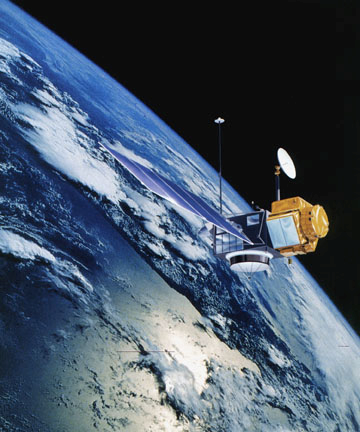
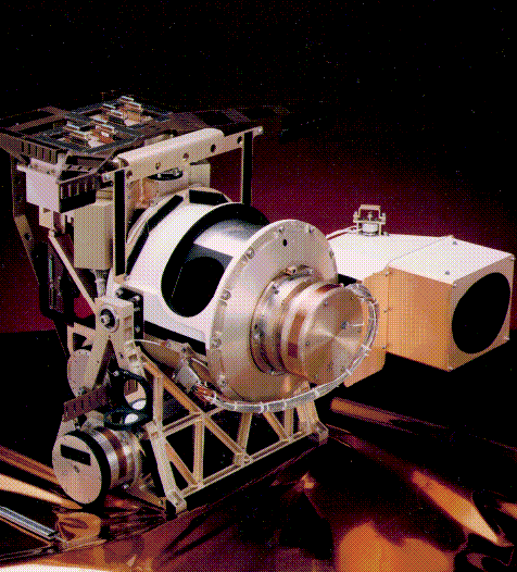
5 . The satellite shown in the figure to the right is 1330 km above the Southern Ocean. It sends a radar
pulse downward at the speed of light: 300,000 km/second. Estimate
the time it takes for the pulse to return to the satellite? (HINT:
Distance Traveled = Speed x Time)
. The satellite shown in the figure to the right is 1330 km above the Southern Ocean. It sends a radar
pulse downward at the speed of light: 300,000 km/second. Estimate
the time it takes for the pulse to return to the satellite? (HINT:
Distance Traveled = Speed x Time)
Time = distance/speed
= 2 x 1330/300,000
= 8.86 x10⁻³ sec
= 8.86 millisecond
6. Radiation emitted by the ocean surface must pass through the atmosphere to reach the satellite. How would aerosols (minute particles derived from desert dust, volcano emissions, smoke from wood and fossil fuels) in the atmosphere affect the radiation received by the satellite? Would the ocean surface appear colder or warmer than it really is? “Colder” means that the satellite receives less radiation than the ocean surface emits. “Warmer” means that the satellite receives more radiation than the ocean surface emits.
The
aerosols absorb radiation from the sea surface then re-radiate the
radiation at a lower temperature, so the surface appears cooler. So
one would expect the satellite to view less radiation than it should
and measure a colder sea temperature than is correct.
This effect of aerosols on SST measurements provides an example of a systematic error that causes a measurement to be consistently larger or smaller than the true value. Random errors cause measurements to be sometimes higher and sometimes lower than the true value.
7. Scientists, just like sailors, use the wave patterns of the ocean surface to estimate wind speed. When you wake up in the morning and look out a window, what clues alert you to unusual weather outside (for example, high winds, extreme cold or heat, heavy precipitation, unsteady or changing weather)?
Leaves or debris blowing, tree limbs bending in the wind, icicles dripping from the roof, deep puddles of water on the ground, dark clouds in the sky, wilted grass and plants, types of clothing seen on people outside.
8. Sailors know that oil spread on the ocean surface tends to reduce waves. If SeaWinds
tries to measure the wind speed over an oil slick, will it give a wind speed that is above or below the true value?
If the ocean is smooth, SeaWinds will say that the wind speed is low. So a major oil slick could cause SeaWinds to report lower-than-actual speed winds.
9. Can the SeaWinds satellite be used to measure winds over the land? Why or why not?
SeaWinds uses the roughness of the waves on the surface of the water to judge wind speed. Land surfaces do not change with wind speed so provide no information about wind speed. Land weather stations provide surface wind speed information.
10. The SeaWiFS instrument measures reflected radiation intensity in various visible (as well as invisible) wavelength bands. Identify the colors that best match each of the following SeaWiFS visible wavelengths. Refer to this linked website for more detail about the color spectrum:

Band |
Visible |
Relation to Substances |
Nearest Color |
|---|---|---|---|
| 1 | 443 | Chlorophyll Absorption | Violet |
| 2 | 520 | Chlorophyll | Green |
| 3 | 550 | Sediments | Yellow |
| 4 | 670 | Chlorophyll Absorption | Red |
Gathering data is not enough. Collections of data are only raw materials like words in a dictionary or bricks in a pile. A dictionary of words does not make a Shakespeare play, and a pile of bricks does not make a home. Likewise, the Results, Conclusion and Theory steps of the scientific method require you to build your case to answer a significant question with data and decide whether your hypothesis is correct.
Scientific Method
• Question: Be curious and ask questions.
• Hypothesis: Develop and refine a hypothesis that you can test with data.
• Experiment: Perform an experiment (or select a satellite data product) and gather data useful for testing the hypothesis.
• Results: Review experiment’s results. If the results are not sufficient to test the hypothesis, return to one of the prior steps (Question, Hypothesis, Experiment) that need refinement. Otherwise, continue to the next step (Conclusion).
• Conclusion: Articulate a conclusion based on the data.
• Theory: Develop an explanation or theory that may account for data. Return to the Question step to further test your theory.
Today
many of the properties and behaviors of air and water vapor are well
known; this does not, however, make it easy to predict tomorrow’s
weather with 100% confidence. Knowing all the rules of baseball or of
a video game does not allow one to predict the final outcome of a
game. The vastness and changeability of the atmosphere makes it
difficult to assemble a complete data set characterizing its state at
any one moment. Unknowns or uncertainties about the state of the
atmosphere at one time make future predictions uncertain. Imagine
trying to predict the outcome of a baseball game based on a few
photographs taken at random times during a game.
In
this next section, you will be able to use data resources and tools
to engage in your own studies of the ocean’s surface. Several
introductory studies have been included in this guide to help you get
started. The studies are not exhaustive and focus on simple
questions. The data resources and processing tools provided on this
website are open-ended and can be applied in further studies.
Learning one fact from data should lead to developing better
follow-up questions. This should not be discouraging. It is the
process of doing science.
The explorations in this next section are open-ended and do not always lead to simple (Yes/Always or No/Never) answers. You will be using data that are rich with patterns and clues about how the ocean surface behaves. With persistence and the observant, critical eye of an explorer, you might discover some important, new facts about nature.
How
does the speed of ocean surface currents vary with distance from the
Equator?
In
the first study, you will investigate how the speed of ocean surface
currents varies with distance from the Equator. The waters of the
Equator are exposed to a high intensity of solar radiation throughout
the year. The ocean relinquishes most of its heat to the atmosphere
through latent heat flux or evaporation. Ocean currents also
redistribute some of the heat by carrying Equatorial waters towards
the Poles.
Go
online to the Ocean
Surface Currents Visualizer and click on the following starting settings.
The settings of the other controls are not important for this study.
If you do not have access to the Internet, use the graphs provided on
page 12 and 13.
• Parameter: speed
• Tropical Pacific Region: northwest
• Click-on-Map
Data: graph
(Note: Clicking on a colored map region will display a plot of the mean current speed
in the selected 5o x 5o region for all available years.)
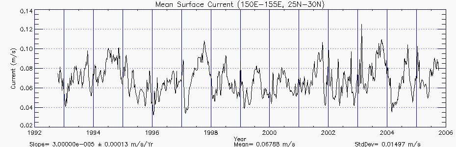
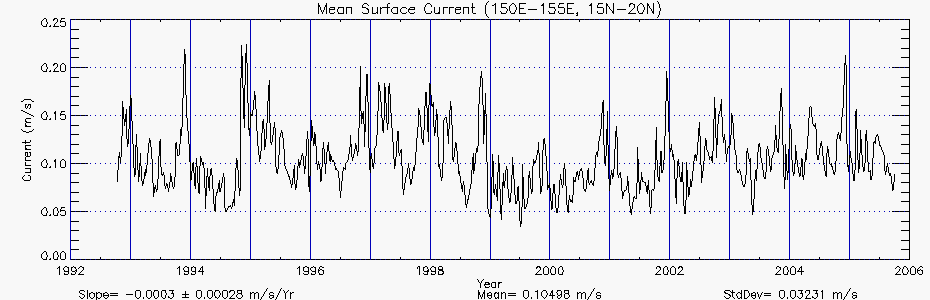
11. Locate the longitude and latitude ranges found in the following chart by moving the hand-shaped cursor over the map that appears on the visualizer. Click on the locations indicated below and a window with a plot of surface current speeds from 1992 to present will appear. At the bottom of each graph you will find three computed values: (1) slope, (2) mean and (3) standard deviation of the surface current. You will only need the mean surface speed for this activity. Round off your values to the nearest hundredth place.
| Longitude Range |
Latitude Range |
Mean Current Speed meters/second |
|---|---|---|
150 E – 155 E |
30 N–35 N |
0.174 |
25 N–30 N |
0.068 |
|
20 N–25 N |
0.093 |
|
15 N–20 N |
0.105 |
|
10 N–15 N |
0.203 |
|
5 N–10 N |
0.180 |
|
0–5 N |
0.364 |


12. To give you a sense of how fast these currents move, compare normal walking pace to the mean surface current speed. Measure out a fixed distance (10, 30 or 50 meters) on flat terrain. Walk at your normal speed and measure how many seconds it takes to walk the distance. Compute your walking speed. How does your walking speed compare to the movement of ocean surface currents?
Distance =50 meters and time = 30.2 seconds
Speed = 50 meters/30.2 sec = 1.66 m/sec
This is 5-10 times greater than the speed of the ocean surface current.
13. Examine the mean values. What happens to the mean speed as currents move farther from the Equator? Where is the mean speed highest? Where is it lowest?
The speeds generally tend to decrease as distance from the Equator increases, except for the peaking at 10N-15N and 30N-35N. The speed is highest at the equator and lowest at 25N-30N. The increase that happens at 10N-15N may be due to equatorial countercurrents. The increase at 30N-35N may be due to the ocean gyre, which is formed in the Northwest Tropical Pacific by the Kuroshio current.
14. You have learned something about a particular location and should study other locations to see if they follow the same pattern. What about other longitudes in the Western (or Central or Eastern) Pacific? What about the Southern Tropical Pacific? Do other locations show the same or different behavior?
To broaden your study, select new locations and fill in the following table:
| Longitude |
Latitude |
Mean Speed (m/sec) |
|---|---|---|
155E -160E |
35S–30S |
0.135 |
30S –25S |
0.100 |
|
25S– 20S |
0.074 |
|
20 S–15S |
0.096 |
|
15S–10S |
0.167 |
|
10S–5S |
0.150 |
|
5S–0 |
0.313 |
15. Examine the mean values. What happens to the mean current speed as you move farther from the Equator? Where is the mean speed highest? Where is it lowest? Does this data show the same pattern as the Northwest 150E-155E data? Can you derive a conclusion and theory from your data?
The
pattern is similar to the pattern north of the equator. The maximum
speed is at the equator (5S-0) and the minimum is at 25S-20S. There
is peaking at 5S-0, 15S-10S and 35S-30S. There is a similar pattern
in the data values. One would probably want to look at data from more
locations before stating a general conclusion and suggesting a
theory. One possible theory is that the currents above and below the
Equator are part of an ocean gyre, which circulates, in a clockwise
pattern in the Northern Hemisphere and in a counterclockwise pattern
in the Southern Hemisphere.
What
are sea surface temperature anomalies and why are they important?
Anomalies are deviations from the normal. Large-scale anomalies can upset the state of the atmosphere. The sea surface temperature anomaly (SSTA) measures the difference between an average (“normal” or “typical”) SST at a site during a specific time of year and the actual SST:
Anomaly
= Actual Value – Average Value
A
positive (or negative) anomaly indicates that the sea surface is
warmer (or colder) than you would expect at the given time of the
year. An anomaly of zero (0.0) means that the temperature is normal
or typical. In this activity, you will explore the equatorial regions
in the Atlantic, Indian and Pacific oceans to study anomaly variation
(or variability) in these three ocean basins. To do this, you will
use a measure of variation called the standard deviation. A high
standard deviation in SSTA data means that that the temperatures
depart more from normal than at a site where the standard deviation
of SSTA is low.
Variations
in the sea surface temperature can be caused by changes in surface
currents, precipitation, wind speed, near-surface air temperature and
upwelling. The sea surface is mostly isolated from deeper layers of
very cold water by a layer of water that is thoroughly mixed (the
mixed layer) and has relatively constant density and temperature. One
might expect smaller sea surface temperature variations where the
mixed layer is deep and larger variations where the mixed layer is
shallow.
To see a map that shows the SSTAs around the world, link to the sea surface environment visualizer and click on the following settings:
• Parameter:Temp Anomaly
• Click-on-Map
Data: Graph
The settings of the other controls are not important for this study.
For this study, limit your data collection to regions in the Atlantic, Indian and Pacific Oceans near the Equator. For each of the three oceans, click on the map at the Equator (0o) for each of the six locations listed in the table. When you click on the map at each location, a pop-up window with a data plot will appear. The value of the standard deviation (StdDev) of all the data is printed at the bottom of each plot. Look at the Measurement Protocol and Data Manipulation in Lesson 2 for additional information about standard deviation.
16. In the table below, record the longitudes and the corresponding standard deviation for the data from the bottom of each graph.
| Sea Surface Temperature Anomalies In Atlantic, Indian and Pacific Oceans at the Equator (0o) |
||||||
|---|---|---|---|---|---|---|
|
|
Atlantic Ocean |
|||||
| Site |
1 |
2 |
3 |
4 |
5 |
6 |
| Longitude |
40W |
35W |
25W |
20W |
5W |
5E |
| Standard Dev. |
0.389 |
0.382 |
0.402 |
0.451 |
0.558 |
0.493 |
|
|
Indian Ocean |
|||||
| Site |
1 |
2 |
3 |
4 |
5 |
6 |
| Longitude |
50E |
55E |
65E |
80E |
90E |
95E |
| Standard Dev. |
0.523 |
0.639 |
0.471 |
0.421 |
0.371 |
0.375 |
|
|
Pacific Ocean |
|||||
| Site |
1 |
2 |
3 |
4 |
5 |
6 |
| Longitude |
155E |
170E |
155W |
145W |
105W |
85W |
| Standard Dev. |
0.390 |
0.528 |
1.020 |
1.059 |
1.100 |
1.024 |
17. Comment on any patterns that you see in your data. Where are SSTAs greatest?
Where are they smallest? Which ocean has the greatest difference between West and East?
Atlantic Ocean - Greatest: East, Smallest: West
Indian Ocean - Greatest: West, Smallest: East
Pacific Ocean - Greatest: East, Smallest: West
Biggest
East/West difference: Pacific Ocean
NOTES:
The Pacific variations are affected by El Niño events that
cause large anomalies and weather disruptions. The Atlantic has
mini-El Niño oceanic events. In the Indian Ocean, there is no
El Niño-like disturbance. The major disturbance in the Indian
Ocean is the Asian Monsoon which happens in the Western Indian Ocean.
So all these variations track major weather disturbances.
Are
there patterns/anomalies in surface current data that could account
for El Niño?
Over the past millennia, the climate has remained remarkably stable. Yet even the most stable climates contain variability. Regional conditions in the ocean and atmosphere shift back and forth. Natural variations in winds, currents, and ocean temperatures can temporarily change regional weather patterns. If these deviations become extreme enough, these disruptions can ripple across the globe. Such changes, especially if they are not foreseen, can devastate communities that rely on predictable weather patterns for their livelihoods.
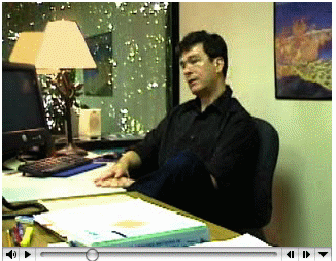 Dr. Fabrice Bonjean describes the significance of ocean surface currents in climate research such as El Niño. Dr. Fabrice Bonjean describes the significance of ocean surface currents in climate research such as El Niño.(click the image to load movie) Transcript - Text QuickTime - High Resolution | Low Resolution Windows Media - High Resolution | Low Resolution |
The most infamous of these disruptions was marked by the arrival of warm currents into the chilly waters off the Peruvian coast. In the 19th century, Peruvian fishermen named this phenomenon El Niño, Spanish for “the Christ child,” because the warm water typically arrived around Christmas. Normally this invasion of warm water is a short-term seasonal event. But every two to seven years, these warm waters stick around for up to 12 to 18 months, signaling a temporary shift in the interaction between the ocean and atmosphere over the |
Today El Niño refers to a long-term invasion of warm
water and its climatic consequences. Torrential rains that normally
fall over the western tropical Pacific shift eastward, flooding the
normally arid Peruvian and Ecuadorian coasts and leaving Indonesia
and eastern Australia high and dry. These rainfall shifts may in turn
disrupt the ocean and atmospheric circulation well beyond the
tropical Pacific. During the severe El Niño events of 1982–83
and 1997–98, droughts and floods struck some of the most vulnerable
areas in the world, including parts of Africa, Southeast Asia, and
Central and South America. In the United States, unusually warm water
made its way up the west coast, triggering torrential rains in
California. Changes in the jet stream increased the frequency of
floods and tornadoes in the southern states. On a brighter note, the
northeast states enjoyed warmer winters and the number of Atlantic
hurricanes decreased.
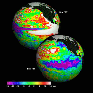
The
TOPEX/Poseidon sea surface height anomaly satellite data, shown in
the two Earth images on the left, help scientists determine the
patterns of the ocean circulation - how heat stored in the ocean
moves from one place to another. Since the ocean holds most of
Earth's heat from the Sun, ocean processes including heat fluxes and
circulation are driving forces of climate. The two globes compare the
1997 El Nino (heights elevated off the Pacific coast of South
America) and the 1999 La Nina (depression of heights in similar
locations).
All
told, floods, mud slides, crop failures, forest fires, and the spread
of diseases attributed to El Niño has contributed to thousands
of deaths around the world, displaced hundreds of thousands of
people, and cost countries tens of billions of dollars.
With so much at stake, physical oceanographers and meteorologists have joined forces to learn what triggers El Niño, why it lasts only 12 to 18 months, and why an El Niño is often followed by a second climate anomaly called La Niña.
18. During the time of El Niño, weather and ocean related phenomena change. Scientists are analyzing data to find relationships between these phenomena and to better understand the dynamics taking place. In the following table, the weather- and ocean-related phenomena are listed in the left column. Develop a hypothesis to show how each of two phenomena might be related to each other.
| Weather and Ocean Related Phenomena |
Relationship Hypothesis |
|---|---|
Very warm ocean surface temperatures and much cooler air temperatures at increasing altitudes in equatorial regions and increased frequency and intensity of rainfall. |
If, from the ocean surface to the top of the troposphere, the air temperature decreases at a high enough rate, then unstable atmospheric conditions will result in more convective clouds (cumulus type) and more rain. This may occur in equatorial regions when ocean surface temperatures reach 28.5°C or higher. |
Diminishing winds along the western South America coastline and along the equator and
Deepening of the warm, nutrient-poor ocean surface layer |
If the winds that move up the western South American coastline and westward along the equator diminish, there will be reduced ocean surface flow away from the coast (to the west) and away from the equator, and thus reduced upwelling of cold water from the depths. |
Deepening of the warm, nutrient-poor ocean surface layer and a slowdown in the upwelling of deep water and changes in varieties and numbers of marine life |
Upwelling carries nutrients from the deep water to the sunny surface waters. If upwelling stops, nutrients no longer reach the surface, the ecosystem starves, and the fisheries diminish. |
 Scientists
recognized that the influence of this weather disturbance stretches
around the globe,
so they deployed buoys,
pictured on the right, in the tropical Pacific Ocean to continuously
monitor the state of the sea surface: surface winds, air temperature,
sea surface/subsurface temperatures, relative humidity and
surface/subsurface water currents.
Scientists
recognized that the influence of this weather disturbance stretches
around the globe,
so they deployed buoys,
pictured on the right, in the tropical Pacific Ocean to continuously
monitor the state of the sea surface: surface winds, air temperature,
sea surface/subsurface temperatures, relative humidity and
surface/subsurface water currents.
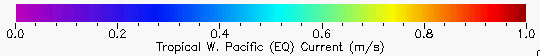
Link,
again, to the Ocean
Surface Currents Visualizer and click the following settings:
• Year: 1997
• Month: FEB
• Parameter: Speed Anomaly
• Tropical Pacific Region: Equatorial West
• Click-on-Map Data: Graph
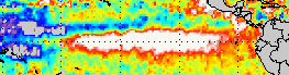
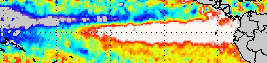
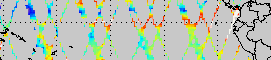
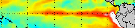
Scientists are interested in surface current changes that occur in the Equatorial Pacific Ocean. To view changes, we are displaying the surface current speed anomaly. Remember that the anomaly is the difference between the actual and average (or typical) value. Note: the Equator is indicated by the 0 on the right side of the map representing 0o latitude. The colors shown in the image represent water current speed anomalies with a legend at the bottom of each page of maps.
19. Using the Next and Back buttons, move forward through 1997 and view the changes in current speed that occur near the equator. During which months are the anomalies highest? During which months are they lowest? Which way are the equatorial currents flowing during each high anomaly month?
During September, October and November of 1997 they are highest. In January and February the anomalies seem lowest. The anomaly current arrows point eastward in the high anomaly months
| Speed Anomalies of the Equatorial West Pacific 1997 |
||
|---|---|---|
|
|
|
|
|
|
|
|
|
|
|
|
Link again to the Sea Surface Environment Visualizer and click on the following settings:

• Year: 1997
• Month: JAN
• Parameter: Temp Anomaly
• Click-on-Map Data: Graph
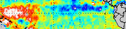
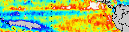
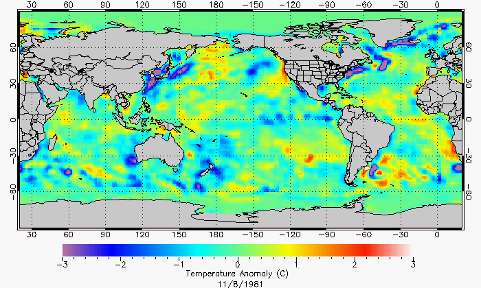
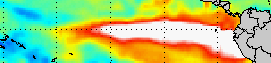
Scientists are interested in changes that occur in the SSTAs in the region indicated by the white outline box in the figure (West Coast of South America, Equatorial Eastern Pacific Ocean). Recall that the temperature anomaly gives the difference between the actual and average sea surface temperature. A high, positive anomaly means that waters are warmer than normal. A low negative anomaly means that waters are colder than normal. The colors shown in the image represent temperature anomalies.
20. Using the NEXT and BACK buttons, move forward from March 1997 and view the changes in SSTAs that occur near the equator and 90W longitude. Describe the pattern of change that you observe in the SSTA images. Continue in 1998 if necessary. When does the major anomaly start? When does it reach its peak? When does it end? Does the anomaly show the water becoming warmer or colder?
A tongue of cold water projects westward along the equator in January. This changes over subsequent months to very warm water. The tongue of cold water disappears in March 1997 and the warm water appears. The phenomenon peaks around November, December 1997 and then drops off. The cold tongue of water seems to reestablish itself in October 1998.
| Temperature Anomalies in East Equatorial Pacific March – December 1997 |
|
|---|---|
|
|
|
|
|
|
|
|
|
|
|
|
Link
again to the Sea
Surface Environment Visualizer and click the following settings:
• Year: 1997
• Month: JAN
• Parameter: Height Anomaly
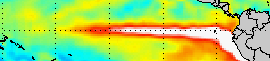
• Click-on-Map Data: Graph
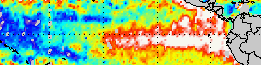
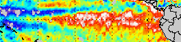
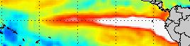
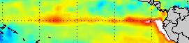
 Scientists
are interested in changes that occur in the sea surface height
anomaly (SSHA) in the region indicated by the white outline box in
the figure (Equatorial Pacific Ocean). Recall that the height anomaly
gives the difference between the actual and average sea surface
temperature. A high, positive anomaly (red, white) means water levels
higher than normal and low, negative anomaly (blue) means water
levels lower than normal.
Scientists
are interested in changes that occur in the sea surface height
anomaly (SSHA) in the region indicated by the white outline box in
the figure (Equatorial Pacific Ocean). Recall that the height anomaly
gives the difference between the actual and average sea surface
temperature. A high, positive anomaly (red, white) means water levels
higher than normal and low, negative anomaly (blue) means water
levels lower than normal.
21. Set the Months and Years controls (or step forward with the NEXT button) to determine if the water levels in the West and East Pacific are at higher (H), Lower (L) or normal (N) levels. H represents a positive anomaly and L represents a negative anomaly.
| Sea Height Anomaly |
1997 |
1998 |
|||||||||||||
|---|---|---|---|---|---|---|---|---|---|---|---|---|---|---|---|
| Jan |
Feb |
Mar |
Apr |
May |
Jun |
Jul |
Aug |
Sep |
Oct |
Nov |
De |
J |
F |
M |
|
West Pacific |
H |
H |
H |
H |
N |
L |
L |
L |
L |
L |
L |
L |
L |
L |
L |
East Pacific |
L |
L |
L |
N (?) |
H |
H |
H |
H |
H |
H |
H |
H |
H |
H |
? |
H – High L – Low N - Normal |
|||||||||||||||
Note on the maps below: The far right side of the map is Central America and the west coast
of South America. The dotted horizontal line in the middle of each map represents the Equator (0o Latitude).
| Sea Surface Height Anomalies in Equatorial Pacific Jan 1997 – April 1998 |
|
|---|---|
January 5, 1997 |
September 10, 1997 |
February 4, 1997 |
October 10, 1997 |
March 6, 1997 |
November 9, 1997 |
April 5, 1997 |
December 8, 1997 |
May 4, 1997 |
January 7, 1998 |
June 3, 1997 |
February 6, 1998 |
July 3, 1997 |
March 8, 1998 |
August 2, 1997 |
Note that the reading for June 3, 1997 is incomplete. The reason is unknown; however, it was included to reduce any confusion that might result if it were omitted. |
|
|
22. Describe the pattern that you see in the SSHA data. Recall your study of Equatorial surface currents. Do your observations of the anomalous current flow agree with what you are seeing in the changes of sea surface height?
During the 1997 El Niño, water appears to move from the West Pacific to the East Pacific.
To continue this study and broaden the applicability of your conclusion, you can select more sample locations. Also you can study patterns in the slope and standard deviation values that you have accumulated. The slope estimates the change in current speed each year. The slope values are given with an estimated error (For example, 0.00236±0.00082 means 0.00236 is the slope and 0.00082 is the estimated error in the slope). If the error value is close to or larger than the slope value, then the slope value is mostly error and could be zero (no significant change each year). Positive (negative) slope values would be evidence of increasing (or decreasing) surface current speed and changes in ocean circulation. Alternatively, you can set the visualizer parameter to “Direction” and make a similar study of the direction of flow of Pacific currents with latitude.
Proficiency Level |
Description |
|---|---|
4 Expert |
Responses show an in-depth understanding of how instruments on satellites collect data used in research to study complex interactions between the atmosphere and the ocean. Proficient manipulation of computer models to read near real-time satellite data. Analysis of data is complete and accurate and responses demonstrate an understanding of patterns in data that provide clues to phenomena such as El Niño.
|
3 Proficient |
Responses show a solid understanding of how instruments on satellites collect data used in research to study complex interactions between the atmosphere and the ocean. Mostly proficient manipulation of computer models to read near real-time satellite data. Analysis of data is mostly complete and accurate and responses mostly demonstrate an understanding of patterns in data that provide clues to phenomena such as El Niño.
|
2 Emergent |
Responses show a partial understanding of how instruments on satellites collect data used in research to study complex interactions between the atmosphere and the ocean. Some proficiency in manipulation of computer models to read near real-time satellite data. Analysis of data is partially complete and accurate, and responses sometimes demonstrate an understanding of patterns in data that provide clues to phenomena such as El Niño.
|
1 Novice |
Responses show a very limited understanding of how instruments on satellites collect data used in research to study complex interactions between the atmosphere and the ocean. Little or no ability in manipulation of computer models to read near real-time satellite data. Analysis of data is partially complete, and accurate and responses demonstrate a limited understanding of patterns in data that provide clues to phenomena such as El Niño.
|
![]() for compliance with Section 508.
for compliance with Section 508.
 January 4, 1997
 July 5, 1997
 February 2, 1997
 August 4,
1997
August 4,
1997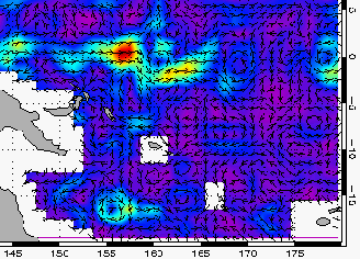 March
5, 1997
March
5, 1997 September 4,
1997
September 4,
1997
 October
5, 1997
October
5, 1997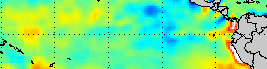


 December 3,
1997
December 3,
1997